How Clarity Drove a 46% Lift in Insurance Purchases
Client
DataStream
Year
2021
Cyber insurance is confusing by design — complex language, long forms, opaque pricing. Customers don't trust the process, so they don't finish it.
DataStream set out to change that: make cyber insurance simple and accessible for any business, regardless of size or technical knowledge. I joined to redesign the full buy flow, from the first question to the signed policy.
Scope of Work
Outcomes
The redesigned buy flow launched in 3 months with measurable improvements across every key metric:
+32% Quote completion rate
+46% Policy purchase rate
+28% Form completion speed
One consistent strategy drove all three: giving customers context and transparency at every step.
My Role
I was one of two designers on the project, working with a Lead Designer, an Illustrator, and the Head of Engineering — reporting directly to the CEO.
My responsibilities spanned the full design process:
User research — planning, conducting, and synthesizing interviews
Information architecture and interaction model
All screens, from wireframes through high-fidelity prototypes
Engineering collaboration on feasibility and implementation trade-offs

Understanding the Business
Before designing anything, we ran stakeholder interviews from the CEO down to sales managers to understand DataStream's current operations. One thing stood out immediately: a 4-page document sent to customers alongside every quote. It was industry-standard — but indefensible from a UX perspective. That was exactly what we were there to fix.
Competitive Research
We studied onboarding flows from top SaaS products to understand how the best experiences reduce friction. Our deepest research focused on Lemonade, which had already proven that buying insurance could feel simple.
User Interviews
To find where the flow was failing, we ran 7 moderated interviews with small business owners who had either completed or abandoned the buy flow. Sessions were recorded and analyzed in Dovetail.
Five patterns emerged:
Technical language created anxiety and caused drop-offs
Form length felt intimidating upfront
Customers had no idea how much coverage they needed
Carrier options were indistinguishable
Past insurance experiences made customers skeptical about what was actually covered
The problem wasn't that people didn't want cyber insurance — the buying experience was actively working against them. Every design decision that followed was rooted in these five findings.

Wireframes
We explored multiple flow structures before committing to one. The core question: what should the user see first, and in what order?
Design Decisions
Five problems. Five decisions. Here's how we solved each one.


1. Making the Form Feel Short
Finding: Customers expected a quick quote and felt overwhelmed by the data required.
The tension: DataStream needs detailed business information for accurate underwriting. Removing questions wasn't an option — but making the form feel lighter was.
What we tried first: A 4–5 question prototype. Testing showed quotes were too imprecise — estimates shifted dramatically after full underwriting, destroying trust. Less friction upfront created worse friction downstream.
What we built instead:
Autofill by company name. A Google API pre-fills address, industry, size, and revenue — cutting form completion time by 70%.
Step-by-step layout with progress bar. Four grouped steps so customers always know where they are.
Time estimate and context. A sticky explainer states why each question is needed and how long it takes.
Smart defaults. Pre-filled answers for common business types, with a clear note: "We prefilled this — correct us if needed."

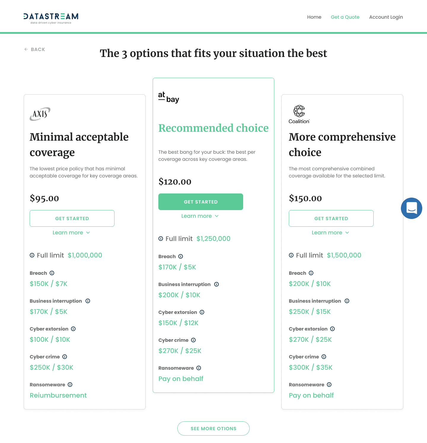
2. Helping Customers Choose Coverage
Finding: Customers had no framework for estimating coverage — the highest-anxiety moment in the flow.
The insight: Business owners feared both overpaying and being underinsured. The flow offered no guidance, effectively asking customers to act as their own underwriter. DataStream's phone consultants already had a great framework: coverage should equal roughly a quarter of annual revenue, plus a breakdown of typical attack costs. That knowledge lived only in phone calls — not in the product.
What we built:
A recommended amount with clear reasoning. The flow suggests a specific figure (e.g., $2M) and explains what it covers: legal costs, technical repair, PR, fines, and lost income.
A "Learn Why" deep-dive for skeptics. A detailed explainer shows the real cost of a cyber attack, how business interruption accounts for a third of total damage, and what similar companies in the same industry typically choose.
The goal: give every customer the same guidance a human consultant would provide.
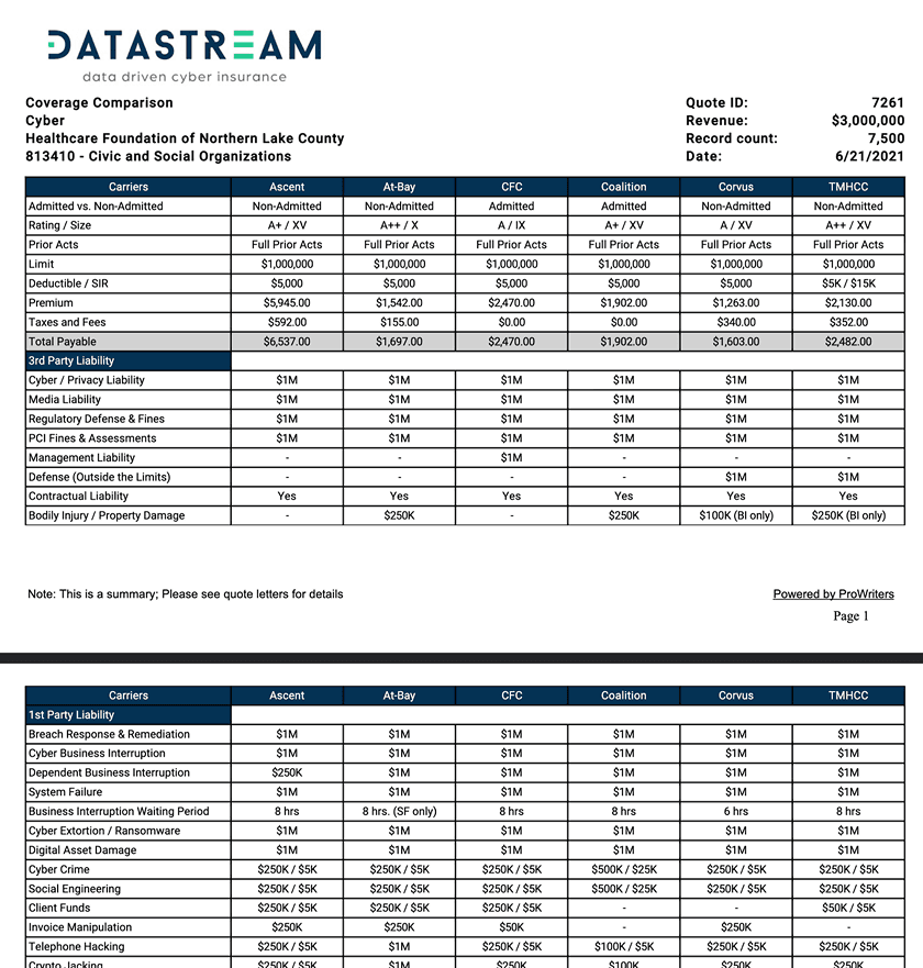
3. Making Carrier Comparison Meaningful
Finding: Customers couldn't tell carriers apart and felt stuck.
What we built:
Top 3 options, curated for context. Instead of listing every available carrier, we surface the three best fits for the customer's situation — each with a distinct value proposition.
Side-by-side coverage numbers. Exact limits for breach, business interruption, cyber extortion, cybercrime, and ransomware — the categories customers actually asked about.
Why we filtered the rest. Below the top 3, we show excluded carriers and explain why. Showing what we rejected made customers more confident in what we recommended.
The opinionated approach — recommending rather than just listing — was the difference between a decision and a stall.

4. Setting Accurate Coverage Expectations
Finding: Past bad experiences made customers skeptical about what a policy would actually cover.
What we built: A comprehensive coverage summary before the final sign-and-pay step — explicitly showing both what is and isn't covered. Each category includes a plain-language description, a real-world example, and the maximum payout.
Most competitors bury exclusions in post-purchase documents. By surfacing limitations upfront, we turned a moment of anxiety into a moment of confidence.
Design Validation
After completing the design phase, we recruited 8 small business owners unfamiliar with DataStream and ran moderated usability testing with a Figma prototype. Feedback was strongly positive. A few friction points surfaced — buried buttons, unclear labels, sequence issues — which we resolved before final handoff.
Reflection
The biggest compromise was one I fought hard against. DataStream's primary green fails WCAG AA contrast standards. I raised it early with documented contrast ratios and two alternative greens that preserved the brand feel. The CEO refused — the exact shade was a core brand element. Looking back, I'd frame the argument differently. Instead of "accessibility vs. brand," I'd present it as business risk: legal exposure, excluding ~8% of users with visual impairments, and the cost of failing an accessibility audit. Speaking the language of risk and liability — the same language DataStream uses to sell insurance — would have been more persuasive than a design argument alone.
The lesson: when pushing for the right decision, speak the stakeholder's language, not yours.